Level Design
This is the page where I put all of the level design stuff that I am currently working on, or have finished. Mostly finished, though - I tend to not promote.
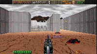
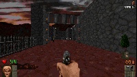
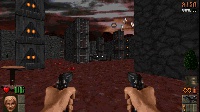
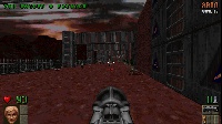
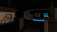
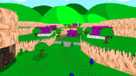
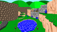
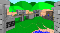
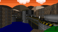
As you can probably tell, I'm still making Doom maps. In my mind, Doom is still the one game where you can make something amazing and for significantly less time than you would make something for a different, more advanced engine. I tinker around with other games and technologies as well, so if I make something that I feel is worth sharing, it will be here.
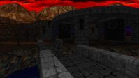
Vestiges of Grandeur (2025)
| Year: | 2025 | ||
| Game: | Heretic + Hexen | # of Maps: | 6 (out of 9) |
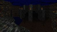
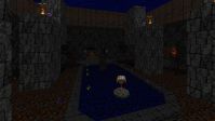
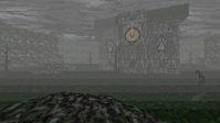
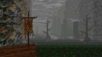
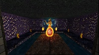
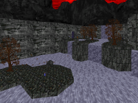
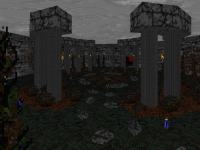
As soon as I heard that I was going to be working on Heretic + Hexen (especially Hexen), I wanted to make a new hub for it. A big, epic one, but still manageable enough to navigate and complete once the player has been dragged around enough among its sprawling maps.
I designed the hub in two phases - the first was going to use the chalices as a means to introduce each map that the player was going to need to do objectives in, and the second phase was a key and puzzle item hunt now that all of the side maps were introduced.
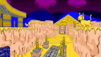
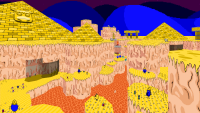
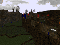
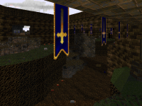
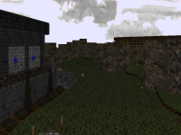
The maps follow a bit of a retro aesthetic, letting the player's brain fill in the gaps where detailed architecture didn't exist. This contrasts them from the other maps done by other authors in the hub, but then again, it allowed me to quickly work on and iterate on each of the maps, finding bugs that may or may not exist, and there were a lot of maps that I made.
Killing Time: Resurrected (2024)
| Year: | 2024 | ||
| Game: | Killing Time: Resurrected | # of Maps: | Nearly all touched-up |
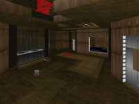
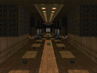
For Killing Time: Resurrected, I was given carte-blanche access to all of the maps of the original game, tasked with fixing up some of the more... "problematic" of their layouts and gameplay, as well as making some areas a little more detailed with some "Doom-cute" accoutrement.
The challenge for this game was to ascertain the original design from the maps themselves, as well as finding the orginal places that inspired them from the original 3DO version, and then figuring out what I should change versus what I could change. I wanted to keep the feel of the original game as much as possible, but some of the maps I had to "fix up" had cramped, maze-like hallways, several side rooms that added to navigational confusion, and areas that seemed either rushed or uninspired, no offense to the original designers (we made sure that the original maps were still findable).
In the end, I think I did an okay job fixing up the game so that players will have a worthwhile experience, and hopefully the "Killing Time Purists" (assuming they exist) won't have too much of an issue with what I changed.
Rise of the Triad: Ludicrous Edition (2023)
| Year: | 2023 | ||
| Game: | Rise of the Triad: Ludicrous Edition | # of Maps: | 10 |
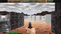
I made 10 maps for ROTT:LE and of those, 4 got included in the official episode, but I couldn't let those other 6 go to waste, so they got added to the "Reject Pile" in the Steam Workshop.
The last time I made maps for ROTT was 20 years ago, so this was like taking a trip down memory lane - a janky, wierd, orthogonal memory lane. ROTT isn't the most easy thing to make maps for with its limits, but luckily, a lot of those limits were relaxed for the Ludicrous Edition, such as masked wall limits and moving tile limits.
All in all, I had a blast making more ROTT content, and I hope that you have a blast playing it!
The Adventures of Square Episode 2 (2018)
| Year: | 2018 | Name: | square1.pk3 |
| Game: | The Adventures of Square (Episode 2) | # of Maps: | 3 designed, 12 playtested |
This time around for The Adventures of Square, I designed three maps for Episode 2 while I was still doing sound design and balancing.
This is also the first time I had a more serious voice acting role as Dr. Octagon!
The Adventures of Square Episode 1 (2014)
| Year: | 2014 | Name: | square1.pk3 |
| Game: | The Adventures of Square | # of Maps: | 1 designed, 10 playtested |
I designed only one map for Episode 1 of The Adventures of Square, but that was because I was busy with the sound design, rebalancing, voice acting, and tons of other stuff in it.
This could also be considered my first foray into making an entirely standalone game, as it does not require a Doom game base to run. There will be 3 episodes in total, and this is just the first one.
Forsaken Overlook (2013)
| Year: | 2013 | Name: | fsknovlk.wad |
| Game: | Doom 2 (using Boom) | # of Maps: | 1 map |
This WAD won a 2013 Cacoward!
Forsaken Overlook was created in the end of 2012 into 2013 for a project headed by Brian "Snakes" Knox called the "Secret Santa Imitation Project." For this project, map authors in the Doom Community were told to create a map in the style of another author, but you were assigned one at random out of the pool of participants.
The mapper that I was assigned was Chris Kassap, a.k.a. "lupinx-Kassman," a mapper whose works can be found in several community projects, and are generally very spacious and showy in terms of architecture and size. I was challenged significantly by this assignment, because, after all, I am terrible at making large maps.
I included a post-mortem of my contribution, discussing what worked and what didn't work, and what habits were tough to break throughout my endeavor to make a convincing lupinx-Kassman map. In some places I succeeded, and in some places I didn't, but in the end, I'm proud of my contribution, and I think it is one of my finest works. I am glad that I was given a mapper that would take me out of my comfort zone, and hopefully what I have learned in this project will help me create better maps in the future.
Coffee Break Episode 1 (2012)
| Year: | 2012 | Name: | cafebrk1.wad |
| Game: | Doom 2 (using Boom) | # of Maps: | 11 maps |
This WAD was a runner-up for the 2012 Cacowards!
Anybody who knows me knows that my Achilles Heel is long maps, so I decided to remedy that with a group of several short maps. Originally, this was going to be a megawad of them - 32 maps replaced - but I guess laziness and lack of interest got the better of me, this time. I started making this in 2009, and planned on finishing it around the end of 2010. Totally not the case.
So instead of 32 maps that could've been possibly terrible because of lack of inspiration, you get 11 maps that have been playtested to death. Each map also has a one-word name, to keep with the spirit of the short maps.
MAP01: Storage - Like most first maps, they have to be somewhat easy, but memorable. I tried to do that, here. Originally, it didn't have the craggy section in the western part of the map - I added it in near the end of development, since the rest of the maps had changed in detail over the years that I spent making them.
MAP02: Reservoir - This map is probably the plainest-looking out of all of the maps. I didn't spend a lot of time detailing it, and it still has a lot of my old-style computer consoles in it (as well as the first map). It's also the first time that I have the player actually enter an area past a locked door that they need a key to open. What was a wierd stream-of-consciousness thing hopefully turned into something unexpected for the player.
MAP03: Outpost - Not really much to say about this map, other than I liked playing with floor levels and made it so that the player would eventually get to the places on which the monsters were perched. My maps tend to be a little flat, so this was me trying to introduce a little bit of that to my present skill set.
It's still kinda flat.
MAP04: Toxic - A pretty flat map featuring a bunch of exploding barrels, and some conveyor belts in the beginning of the map - something that isn't usually used in most Boom engine maps. I tried my damnedest to make barrels a prominent feature in the maps and very useful to the player, but it worked to varying effectiveness. Still, you had to use them to give yourself an easier time after you grabbed the red key, so when you destroyed them was important.
MAP05: Control - I came up with the name of this map way after I made it, because I wasn't sure what I made, other than some kind of base with a bridge that you need to raise at the end. The player is given a bit of choice as to what to tackle first in the map, but you'll need better weapons than what you are given at the beginning. I remember worrying about the length of the map, because I originally wanted all of the maps to be completable in 5 minutes without speedrunning, so I had gotten rid of more places where monsters could teleport into the main areas.
MAP06: Checkpoint - One of my more painfully symmetrical maps that I kind of regret designing, because I feel that asymmetry makes a map more interesting. But near the end when the Spider Mastermind is released, you are imperiled by it on the way back from the second switch, so the gameplay isn't that symmetrical at some point. You also grab a lot of weapons at once in two of the rooms in the map, which I think always feels great.
I also experimented with what I call "snowflaking" in this map, where I create a pattern and duplicate it around itself, creating interesting shapes and designs, much like how you would fold up paper and make cuts in it to create paper snowflakes. It's always hard to decorate ceilings, I find.
MAP07: Deadly - It's pretty much an unspoken rule someplace that every MAP07 has to involve Mancubi and Arachnotrons, but it's hard to make them threatening, sometimes. But if you open the map up, then they could roam everywhere, and the player won't be able to run! Still more symmetry here that could have been turned into something better, I feel. It's still fun, though.
MAP08: Archives - In this map, the player is dragged around the place twice before they reach the outside. I also started getting creative with the hanging vine textures, making it look like the stone-and-wood complex was overrun with greenery, to the point where it was hanging down inside of the complex. I was still never satisfied with the final fight at the end, though, no matter how much I changed it.
MAP09: Channel - A lot of stuff happens in this map with monsters rising out of the ground and dropping into play in unexpected places. Also revisits the "going around the map twice" thing that I did in MAP08 in a way. A lot of time was spent creating the rock formations, and I was worried that it was going to look obnoxious in the end, but it looked pretty cool when I was finished. I always prefer making something that looks organic versus sterile, like a military base - more interesting layouts, that way.
MAP10: Fort - This map uses two things that I feel are tragically unexplored in Boom WADs these days - mud traps and impossible spaces. I wanted to use the mud trap near the northern part of the map as a better punishment than a damaging floor - if the player can't move, they'll be at the mercy of the Arch-vile if it's still alive. My favorite part was constructing the portal to Hell right in the middle of the map - a small break from the organic style of the later maps and cool effect using the "no-fog" teleport lines. Hopefully, it surprised a few players.
MAP11: Stalker - Kind of in the vein of Plutonia Revisited's MAP28, I wanted to use the Cyberdemon as a constant threat again, and then the player will have to fight it at the end. This map was also the biggest pain to ammo balance, since I didn't want the player to be able to kill the Cyberdemon before the end, but the possibility still existed if you played all the way through all of the maps up to this one. Ornate rock formations make another appearance, here, adding a natural feel to the stone complex.
What are you waiting for? Play it!
Portal 2 Community Maps (2012)
| Year: | 2012 | Name: | Portal 2 Community Maps |
| Game: | Portal 2 | # of Maps: | Several, ongoing |
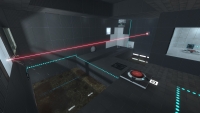
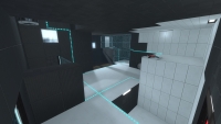
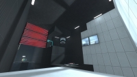
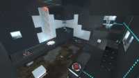
Once Valve had released a more streamlined map editor for Portal 2, I thought that I should finally roll up my sleeves and dive right into making some puzzles. The in-game map builder is one of the most polished, accessible, fun-to-use editor that I've ever had the pleasure of using, and makes the process of turning ideas into realities a breeze.
I've always wanted to make maps since Portal came out back in 2008, but lack of personal time and the difficulty of learning Hammer, along with a lack of prefabs for some of Portal's common elements, kept me from starting. I mean, I've used WorldCraft, Hammer's predecessor, but the time and effort to relearn it wasn't something I wanted to invest. And, when it got right down to it, the time it would take to create a simple puzzle wouldn't be worth it in the end, I felt.
But now, thanks to the in-game editor, creating tricky puzzles has never been easier, or as fun! So every once in a while, I'll create and publish a map, using all of that extra time and effort to make something players can enjoy.
Plutonia Revisited Community Project (2011)
| Year: | 2011 | Name: | prcp.wad |
| Game: | Doom 2 (Vanilla) | # of Maps: | 3 maps out of 32 |
This WAD won a 2011 Cacoward!
Another Doomworld community project, another three maps by Yours Truly. Plutonia Revisited is another 32 maps, made within the span of half a year, to mimic the time created by Dario and Milo Casali when they made the original Plutonia Experiment for Final Doom. Since the maps had to be Plutonia inspired and styled, they could be very difficult, but also short enough to speedrun and be made for compatibility with vanilla Doom (and all of the limits that using it would entail).
MAP06: Stony Halls - The one thing that I love doing but never really have the chance to do is a classic Charlie Brown "Lucy pulls away the football" maneuver, and I do it right at the beginning with the red key. The other thing that I like doing is making non-linear layout maps, so once you are prevented from getting that key, you have to make a decision as to where to go next while a bunch of monsters bear down on you.
Balancing a map like this is difficult. You want to give the player a fair shot no matter which direction they take, because every player is different. You also don't want to see players struggling because they missed a large piece of the map, which may contain an important powerup or weapon.
I like how this map turned out. It's largish and imposing at first, but player doesn't get lost and there is a definite route to take through the map once the red key is taken. It also gives the player some options, which pleased playtesters.
MAP16: Gambit - For this map, I wanted to create some kind of obstruction for player progress that wasn't key or switch-related. In the beginning of the map, you have a large wall of baddies in front of you, and that shotgun you pick up at the start is not going to be enough. It isn't until later that you will be able to find some better firepower.
There are also other parts that force the player to get to defensive positions or force monsters to kill each other in order to progress due to lack of ammunition, and this kind of obstacle is rarely seen in Doom maps. I wanted to make the player face something new - make them think. A thinking player is a happy player, and the real trick is to get them thinking on their toes and re-assessing threats without frustrating them.
MAP28: Dance with the Devil - This map revolves around killing cyberdemons, but there is never enough ammo to kill them. At least, not when you meet them initially, that is.
Far too often are cyberdemons used as enforcers, and not the intimidating threat that they should be. Maybe it's my many years of playing Doom, but I no longer break out into a sweat when I hear that frightening roar and metallic clomping of its cybernetic hoof. I just think, "Do I have a super-shotgun and 40 shells? Game on."
I felt that other players may feel the same way, so I made it so that either you wouldn't have enough ammo to take on a cyberdemon, or you wouldn't be able to fight them without exhausting your ammo supply - ammo that you should be using on other threats, and when you don't have the ammo, making other monsters attack the cyberdemons would be in your best interest, if you want extra ammo later.
But however you approach it, the cyberdemons need to die, because they are guarding the keys that you need to exit the map. Which one should you defeat first?
Scourge of Viscerus (2010)
| Year: | 2010 | Name: | viscerus.pk3 |
| Game: | Hexen (with ZDoom) | # of Maps: | 7 maps |
SoV was a 7-map hub that I started building in my later years in college, back when I was getting into Doom mapping again. It was originally going to be just another vanilla Hexen mapset, but that eventually turned into a ZDoom Hexen mapset when I figured that it was just easier to do, not needing to worry about visplane overflows and which version of ACS to use.
I didn't use very many ZDoom features in the end, aside from new actors (the bosses) and some room-over-room and cinematics, but I felt pushing the limits of the source port was entirely unnecessary.
I'm very glad that I asked for outside testers for this one - it would not have gotten the acclaim that it did if I hadn't. Just goes to show that you should always get outside opinions on what you make before you release.
Community Chest 3 (2007)
| Year: | 2007 | Name: | cchest3.wad |
| Game: | Doom 2 (using Boom) | # of Maps: | 3 maps out of 32 |
This WAD won a 2007 Cacoward!
So, this is what Community Chest 3 became. A collection of 32 levels from a lot of mappers that frequent Doomworld. The maps could be made for the Boom source port, allowing for some expanded features like how much level geometry could be drawn at once, which enabled authors to create some crazily-detailed maps and imposing hordes of monsters to populate them. I had made three contributions.
MAP07: Simple Complex - This map was one of the first maps that I made for CC3 - a sprawling complex that eventually took the player to each corner of the map, and then back to the center, where the map opens up completely for the final battle against the Mancubi and Arachnotrons.
The map isn't entirely without flaw - for one, in the southern part of the map, the player can easily escape a large horde of monsters that appear after the red key is grabbed, and it becomes frustrating for those who attempt a 100% Ultra-Violence run of the map, a thing I had not considered when making it. Nonetheless, I felt that this map was a worthy addition to CC3.
MAP29: For We Are Many - Quite possibly the largest map I have ever made for any game, ever. Its map information alone is about 3 MB, which is quite large for a Doom map. It takes about 50-60 minutes to complete, on average. This map, though, is a love-it-or-hate-it map, which I had discovered later once I had finished it and released it into the project.
Though it received a lot of praise in the Doom Community, I personally had mixed feelings about this map. On one hand, it pushes the Boom engine limits in terms of level geometry and map information, and serves as an excellent MAP 29 - a long, difficult slaughtermap leading up to the final battle. On the other hand, it serves as a reminder to myself about why I am terrible at making long maps. Eventually, I start running out of ideas and the map starts to become a monotonous slog, with repetitive features and pitfalls. Some parts are clearly inspired. Others are not. Still, its a lot better than anything that I had ever made at the time, and improvement is always good.
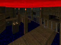
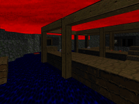
MAP30: Leviathan - The ending map to CC3. It is set inside of deepest Hell, with large floating buildings in an endless void of nothing. The goal of this map was "unsettling and creepy," and I think I succeeded. I tried my damnedest to get the Hebrew LVTHN to look correctly in two places.
Xexis (2006)
| Year: | 2006 | Name: | xexis.wad |
| Game: | Doom 2 (using ZDoom) | # of Maps: | 1 large map |
Back when the third Community Chest project at Doomworld was supposed to be a 32-map megawad for the ZDoom source port, I had joined to make a map, using the techniques that I refined through my stay at college. However, due to overall inactivity and the lack of what I would imagine to be "a cohesive direction" and the fear that it could be an unplayable mess of a megawad, it was abandoned and started back up as a 32-level megawad for the Boom Source port (less features, but still limit-removing). Rather than retool or scrap what I had done so far, I decided to release this as a stand-alone map. I ended up contributing to CC3 when it was revived later on in the year.
Looking back, it could have used a little bit more testing by other people before I pushed it out of the door. One of the biggest complaints was the over-abundance of RED that is everywhere. The other was a set of red-rock staircases that I must have replicated in three places, which is what happens when I start running out of ideas to fill in large gaps of space.
Still, for not releasing anything for Doom in a long time, I'd say that this is as good a map as any, and became the harbinger of my return to the Doom Engine.
Look out, everyone - Matt's back!
