Old Level Design
In here, you will find a whole lot of old stuff that I made far into the past.
I'm under the impression that a lot of people would prefer their old work be dead and buried. On the contrary, I personally believe that old work is just as important as the latest work, since it shows improvement over time!
Because with age, comes wisdom! And with failure, comes experience! So by now, I'm probably the wisest, most experienced map-maker ever!
Hopefully.
Anyway, behold the dated and sometimes embarassing contents of the Old Level Design page!
MTTourney (2000-2001)
| Year: | 2000-2001 | Name: | mttourney.pk3 | Game: | Quake 3 Arena |
| # of Maps: | 5 maps | Rating: | Not My Best, but Pretty Fun | ||
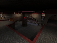
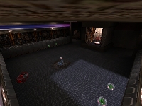
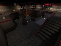
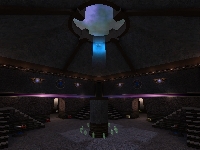
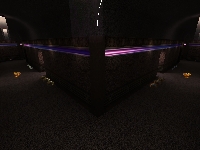
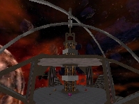
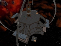
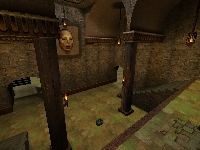
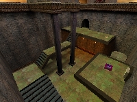
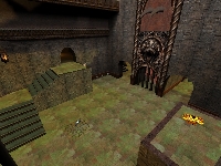
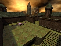
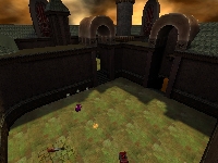
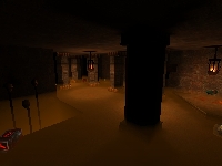
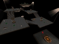
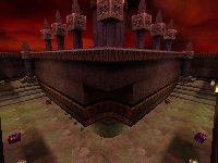
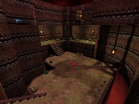
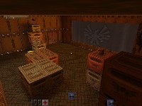
This was a series of Quake 3 Maps that I made that ultimately were never released, but it shows significant improvement on my part as to what textures to use together and what layouts tend to be more fun. Two maps were kind of experimental - the second map and the third, as those were the maps that seemed to be the most different.
Maybe one of these days I should start mapping again for Quake 3 once the official Quake Live development kit is released...
Rail Arena (1999)
| Year: | 1999 | Name: | q3matt2.pk3 | Game: | Quake 3 Arena |
| # of Maps: | 1 map | Rating: | Merely Okay | ||
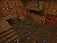
This was a hell of a lot better attempt at a Quake 3 Map, to the point of restricting texture use to bland, inoffensive textures, and sticking with what I knew, which in this case was a Railgun Arena map. People seemed to like the fact that you had to pick up a railgun rather than have it given to you as soon as you spawn.
Turbulance [sic] (1999)
| Year: | 1999 | Name: | q3matt1.pk3 | Game: | Quake 3 Arena |
| # of Maps: | 1 map | Rating: | What Was I Thinking | ||
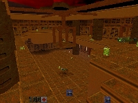
This map is proof-positive that you should never release one your first maps you make for any game ever, and in this case, that game was Quake 3 Arena
The texturing isn't the greatest, the map has a chokepoint involving a railgun and a quad damage, and I have no idea what I was thinking with some of the item layout. I think this was intended for two players. It really should be for zero players. You can also tell that I liked using Bezier curves a little too much.
Starcraft Maps (1998-2000)
| Year: | 1998-2000 | Name: | Various SCM/SCX | Game: | Starcraft |
| # of Maps: | 6 maps | Rating: | Fun as Heck | ||
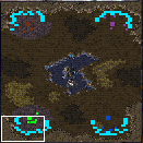
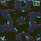
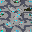
Back when my friends and I were heavily into Starcraft, I decided to try my hand at creating a couple of Free-for-All maps. All of them are fun to play with friends or against the CPU, especially the "Ain't Enough Room" map, a 64x64, 4 player map that forces you to deal with your opponents a lot quicker than you would normally. The largest of the maps, "Command and Annihilate 2", was a bit of an experiment in using multiple terrain levels for harder ground combat and map traversal.
I've made a lot of other maps for Starcraft, but most were campaign ideas that didn't quite pan out.
Quake 2 Maps (1998)
| Year: | ~1998 | Name: | mattdm(1-4).bsp | Game: | Quake 2 |
| # of Maps: | 4 maps | Rating: | Ugly but Maybe Fun | ||
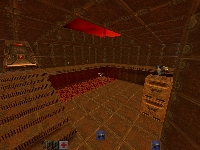
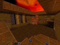
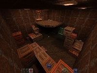
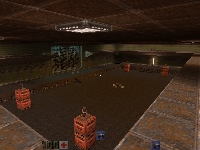
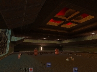
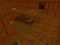
Skipping Quake (but not entirely - didn't release anything of note), I went ahead and started making Quake 2 maps, with a little bit of WorldCraft mastery under my belt, and this is the result. Some good, most bad, but the one that all of my friends seemed to like was the second one in the bunch: the large rail arena.
These tended to be mostly experimental rather than serious, especially the fourth map, where every weapon is a BFG and the map is littered with power cells and power armor. Still, they are pretty fun, and you are bound to like at least one of them.
Route files are included for Eraser Bot.
Dimensions of Time (1998)
| Year: | 1998 | Name: | dot.wad | Game: | Doom 2 |
| # of Maps: | 32 maps | Rating: | Mixed Feelings | ||
About 14 years ago, as of the time of this writing, a thirteen year old, aspiring map author uploaded a set of 32 levels for Doom 2 back in 1998, completing about 1 and 1/2-ish years of work. The maps were short (mostly due to the limitations of the map editor's shareware restrictions at the time) and under-detailed (same reason), but there was heart. A lot of heart.
I was proud to release this. Very proud, indeed. After all, a single-author megawad is an insane undertaking in terms of time and effort, and since I was in middle school, I had all the time in the world with which to make it. I don't really talk about this mapset much, but in comparison to me, the Doom Community talks about it far more than I do (read: more than my practically dead silence).
And yet, I have NO idea why. By today's standards, these maps suck. Hell, by 1998 standards, the year that I finished these, they still suck. Why do people like them so much? I've seen reasons ranging from "having the gameplay nailed down" to "fun to speedrun through." Though, mostly I suspect it's liked today because of nostalgia. There weren't that many single-player or co-op friendly megawads at the time of uploading this, so maybe this is ingrained in the minds of Doomers who remember the "good old days," where standards were low, people threw pop music in wads, and the maps were small and painfully amateur.
Whatever. It isn't my place as the artist to figure out why people like the creation. Every once in a while another YouTube video of this megawad pops up with somebody speedrunning through a map or two (or ALL of them, as I've witnessed), and I get a wonderful feeling that I made something worthwhile, so I guess my feelings about the maps don't matter so much.
Some of maps still use some gameplay concepts unexplored in maps today, so I guess it retains its uniqueness in this regard. My style started to take shape around this time, so if you want to explore my creative history, this is probably a necessary stop.
The Best Wad Ever! (1997)
| Year: | 1997 | Name: | tbwever!.wad | Game: | Doom |
| # of Maps: | 1/2 The Megawad | Rating: | Awful to Merely Okay | ||
The Best Wad Ever!
Not really, looking back, but me and my friend Bill certainly thought so when we released 24 new maps to AOL's file servers back in early 1997 (and the reviewer at AOL thought it was amazing too, I guess - they probably didn't play that many WADs). I can only speak on behalf of myself and my levels in the WAD, since I only made about half of the maps in it, but these maps absolutely pale in comparison to what I make now (obviously). My style was nowhere near as refined as it is today, but the style of maps that I liked to make was clearly evident based on a couple of them.
I remember wanting to be like John Romero and Sandy Petersen and worrying about whether or not my maps looked like something they made, at least on the automap. But since I still sucked at aesthetics, this is the result. So in the end, a crappy set of maps, but I remember the time making them with Bill fondly. Bill still made maps for Doom and Quake, and we planned on releasing a bunch of stuff, but a lot of that is lost to the sands of time, unless he's got them stored away, someplace. We really just seemed to like to create stuff for our friends.
You can find who made what in the accompanying text file in the zip. Not bad for a couple of 12 year olds, if I do say so, myself.
The Matt Add-ons (1996)
| Year: | 1996 | Name: | mattlvls.wad | Game: | Heretic |
| # of Maps: | 9 (8 plus secret) | Rating: | Bad | ||
Not the first thing I released, not even for Heretic. But I made this thing back in 1996, and it's a mish-mosh of music that I found lying around my hard drive and semi-linear (but connected) maps, and in this case the music is some Final Fantasy and Chrono Trigger music, the two MIDIs that come with Windows 95 (PASSPORT and CANYON), and Duke Nukem 3D music, including the Duke Nukem 3D theme song. Ugh.
The levels are simplistic and bland, and sometimes confusing. The music doesn't exactly help. Some parts are overloaded with items and have traps that make little sense.
