Forsaken Overlook Postmortem
Intro
Below is a series of notes and thoughts about my participation in the Secret Santa project.
Studying the Subject
I've been assigned Chris Kassap (lupinx-Kassman) as my imitatee.
The hardest part about studying LK's work is that a bunch of his maps are not released yet. They exist and are playable, but aren't released, and his impression of his older work is that it doesn't reflect his current style, and is him learning the ropes of Doom Editing.
I disagree with this, though - his older works do indeed reflect his current style somewhat - LK, like other mappers such as Erik Alm, Darkwave0000, or Josh Sealy, like SPACE. Lots of space. The more, the better. His outdoor areas are large and give the player lots of room to move.
By contrast, indoors, it's cramped, but detailed. Care is also taken to light each area. This wasn't always the case before, as in his earlier works, but as his skills mature, so does his style. Seems to like railings on walkways a lot. Understands sources of light and basic lighting. The detailing is almost copy-paste at times, but you can tell that he tends to experiment with different textures and such in order to give his maps an interesting look where pure structure won't suffice. Some textures work well together, some do not - but they are still used in a way that makes sense and don't clash terribly in terms of motif and style. Of course, some of this is seen in his earlier works, and back when the zeitgeist of "detail" cast itself over the Doom community.
In speaking of texturing, his texture use sees loads of variety, as opposed to single swaths of color, with high amounts of contrast in every screenshot he takes of his works. Places where lights and darks contrast sharply tend to use less color, but the colors themseleves are vibrant or deep ones. Really likes the "base" or "tech" motif and tends to eschew organic ones, which is a shame, since I'd like to see more of that from him - his emerging style seems to favor the scale of nature rather than man-made structures.

Architecture seems to be built to "wow" with its scale and shape. Lots of local symmetry in areas with "structure." Monster placement seems bunchy, though - but that may be because of map size. His works don't exactly have too much similarity between them, save for the broad characteristics that I mentioned earlier.
Kassman's maps in CC4 (cchest4.wad) make use of "satellite" locations - little self-contained areas that seem to serve as a break from the large areas. Maybe they were a break for him though - creating maps as large as his could be exhausting, creatively. Though that could just be me projecting - if I had to make something that large, I would try to add smaller things in order to not stray too far from my comfort zone.
Another similarity that I'm finding between him and me is the constant striving for perfection. The evidence is there with his "rejected" pieces and maps, and he publishes rarely. This shows that he cares about his work.
All that being said, I'm going to be challenged significantly by this. I already know how I deal with making spacious maps, and that is "poorly" (see CC3 MAP29), but to be honest, it seems that LK suffers from the same difficulties - the challenge to fill the space with monsters, items, and scenery. Sometimes I think that Doom was never meant to scale that largely.
Post Mortem
Creation

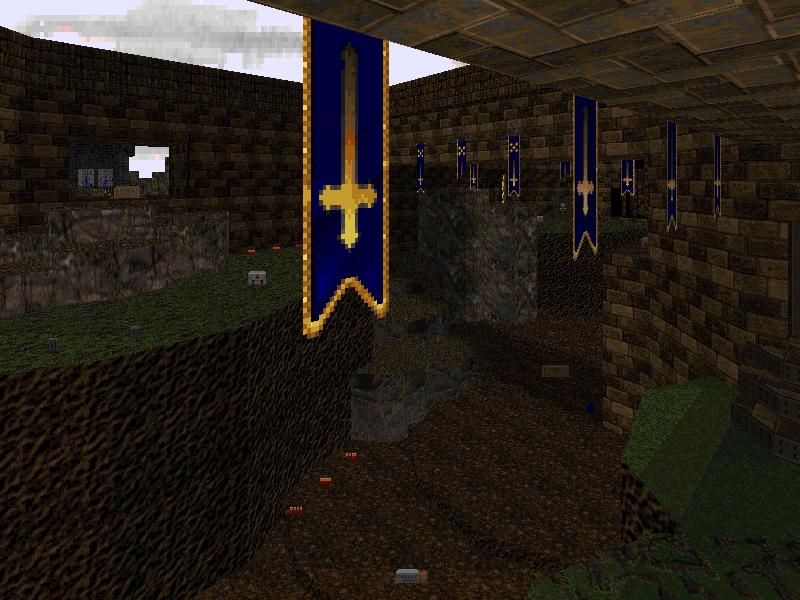
Since I'm not exactly crazy about the base style because it forces me into some bad habits, I decided to make a map that would be a combination of my style and his - one that would favor his love for space. That's why I picked a castle.
Castles are big, LK's maps are big: perfect, right?
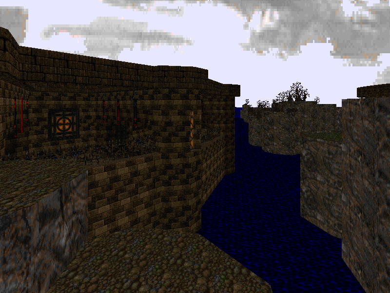
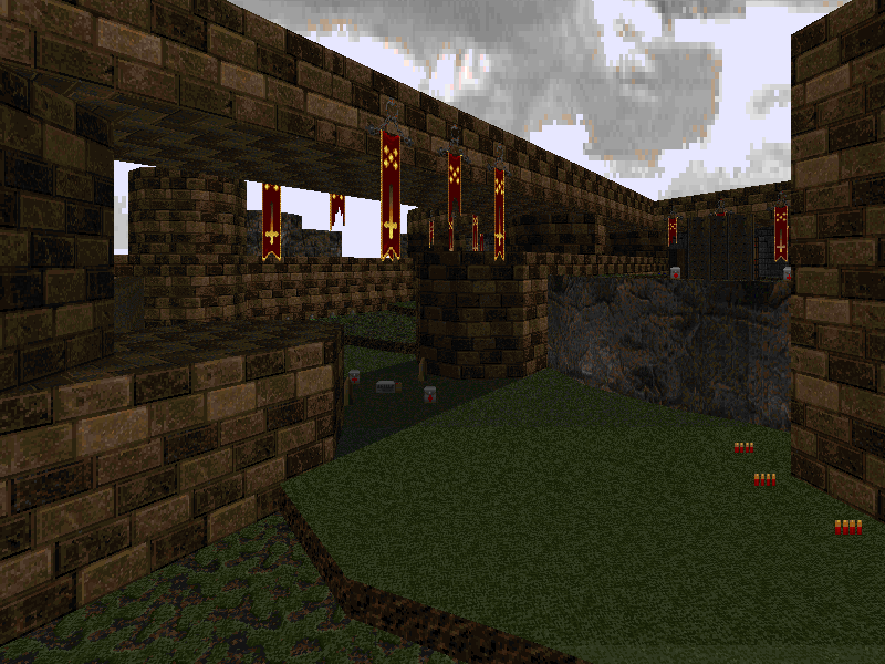
Starting off was bad - I immediately made a smaller area: the kind that I'm used to rather than something large. Since I was kinda off to a bad start, I overcompensated with the giant half-circle and sea. This was all well and good, but it created another problem, how could I populate this with stuff? There's so much room! I decided to leave it the way it was and move to the next area, the back of the castle. Eventually, I just started creating some branches in the map and finding a way to connect it back to the start, trying to avoid the pitfall that I created for myself in Coffee Break MAP11 - the beginning was only visited once. I also made sure that every place in the map was used as much as possible, in order to give the illusion of nonlinearity where it doesn't exist in actuality.
Despite the love and care that I put in this map, I think I utterly failed to make it seem like a "lupinx-Kassman" map, because there aren't many smaller inside areas, and the texture variance isn't too amazing, but I hoped to capture the feeling of a competely expansive space, and there's heavy use of primary colors, and enemies perched in high places and ledges, so hopefully invokes LK-like feelings.
Map Flow
As the map started to grow in size, I started to worry about making the map un-navigatable, as large maps tend to be. The level design technique that I usually employ to mitigate this, however, is making the player see where they WILL go before they CAN go there, which makes players create mental notes of where important landmarks are. You always have to be careful not to give the player goals without giving them notes of where to go next. Doom has to rely heavily on this, since it does not maintain a list of "objectives" that the player can refer to, or a sassy sidekick to remind them of where to go next.
I have a certain flow to making a map - I tend to make them interconnected, John Romero style, so that when I define the route that a player takes, I can just change tags and items accordingly when I don't have a specific idea or script for the player to follow yet. This happened early on - the red door at the beginning wasn't originally locked when I was making the map, but became a locked one once I fleshed out the route the player would take through the initial "keyless" run. Once that key was grabbed, the next area, already seen, becomes the next goal.
For example, if the player sees a locked door, they know that the door will need to be opened by something that they don't have in order to go through it, so while it isn't a "place to go," it is a "place that they will need to go later." Such things create lists in a player's mind: "I can't go there, but once I find the key, I'll have to go there next." Stuff like this is PARAMOUNT to creating a large map so that the player doesn't get lost, frustrated, or bored. Outside of Doom, this technique can be seen in Metroid, Zelda, or other "big world" games.
On the flipside, you can't show the player an obvious goal that they can't get to, or they will make every attempt to reach it, eschewing everything else. Right in the beginning, I show the player the red key. "That is your goal," it says. "This is where you need to be first." The journey to that point is a series of landmarks and "places to go," showing the player what every hidden key will open. But the key that isn't hidden is the red one - they will need to get there at all costs. I don't show the player where the rest of the keys are - if they see another key, they won't know which one is accessible, and they will get lost and frustrated, and this is because they now have two goals, not one. You have to keep the player focused on a singular goal in large maps; never let them wander, or you will lose them forever.
Item Placement
Placing items and enemies is no picnic in a map this size. I was constantly second-guessing myself in terms of monster use and placement, worrying if the player would be discouraged about entering areas, or lead into prepared ambushes. Large maps, without heavy variance in features and terrain, will cause activated enemies to bunch up as they slowly lumber towards the player, and this could cause unwanted crowding, but you don't want to place enemies on ledges everywhere, as the abundance of "snipers" will frustrate players.
The only way to enforce crowd control and to ensure that certain enemies are activated in different places was to create little invisible "pits" to hide them in, and pop them up once the player entered key areas. Cheap, I know, but I tried to mark these areas whenever possible, in order to warn the player first, so they wouldn't be taken too off-guard before the encounter. Another tactic to use for that sort of thing is heavy use of the "ambush/deaf" flag, which kinda felt like cheating, but it did the job. That deaf Cyberdemon in the center area keeps waking up, in every source port, and I don't know why.
Conclusions
All in all, I'm glad to have actually made a map that takes me out of my comfort zone, and hopefully the knowledge that I gained in making something like this creeps its way into other maps I make. I'd like to thank Brian Knox for the opportunity, and lupinx-Kassman for having a distinct enough style to imitate.